diff --git a/CHANGELOG.md b/CHANGELOG.md
index 8d5be82..a19f98a 100644
--- a/CHANGELOG.md
+++ b/CHANGELOG.md
@@ -1,3 +1,15 @@
+## [3.0.2]
+
+* Migrate to `3.0.0`.
+
+## [3.0.1]
+
+* Change `Intro.of(context)?.start()` to `Intro.of(context).start()`.
+
+## [3.0.0]
+
+* Completely rewritten, please refer to example for usage.
+
## [2.3.1]
* Throw a friendly error when something goes wrong.
diff --git a/README.md b/README.md
index 9eff5de..cba3815 100644
--- a/README.md
+++ b/README.md
@@ -4,13 +4,17 @@
A better way for new feature introduction and step-by-step users guide for your Flutter project.
-# Since I no longer work at Tal, the repository has been moved to [https://github.com/minaxorg/flutter_intro](https://github.com/minaxorg/flutter_intro)
+## Since I no longer work at Tal, the repository has been moved from [https://github.com/tal-tech/flutter_intro](https://github.com/tal-tech/flutter_intro) to here.
- +## This is `3.0.0` version, if you find `2.x` documentation, [click here](./README_V2.md).
+
+I completely rewritten the 3.0 version, and the usage is clearer and more concise.
+
+
+## This is `3.0.0` version, if you find `2.x` documentation, [click here](./README_V2.md).
+
+I completely rewritten the 3.0 version, and the usage is clearer and more concise.
+
+ Automatically adapt when the device screen orientation is switched.
-
Automatically adapt when the device screen orientation is switched.
- +
+ ## Usage
@@ -18,159 +22,121 @@ To use this package, add `flutter_intro` as a [dependency in your pubspec.yaml f
### Init
+Wrap the app root widget with `Intro`, also you can set some global properties on `Intro`.
+
```dart
import 'package:flutter_intro/flutter_intro.dart';
-Intro intro = Intro(
- /// You can set it true to disable animation
- noAnimation: false,
-
- /// The total number of guide pages, must be passed
- stepCount: 4,
-
- /// Click on whether the mask is allowed to be closed.
- maskClosable: true,
-
- /// When highlight widget is tapped.
- onHighlightWidgetTap: (introStatus) {
- print(introStatus);
- },
-
+Intro(
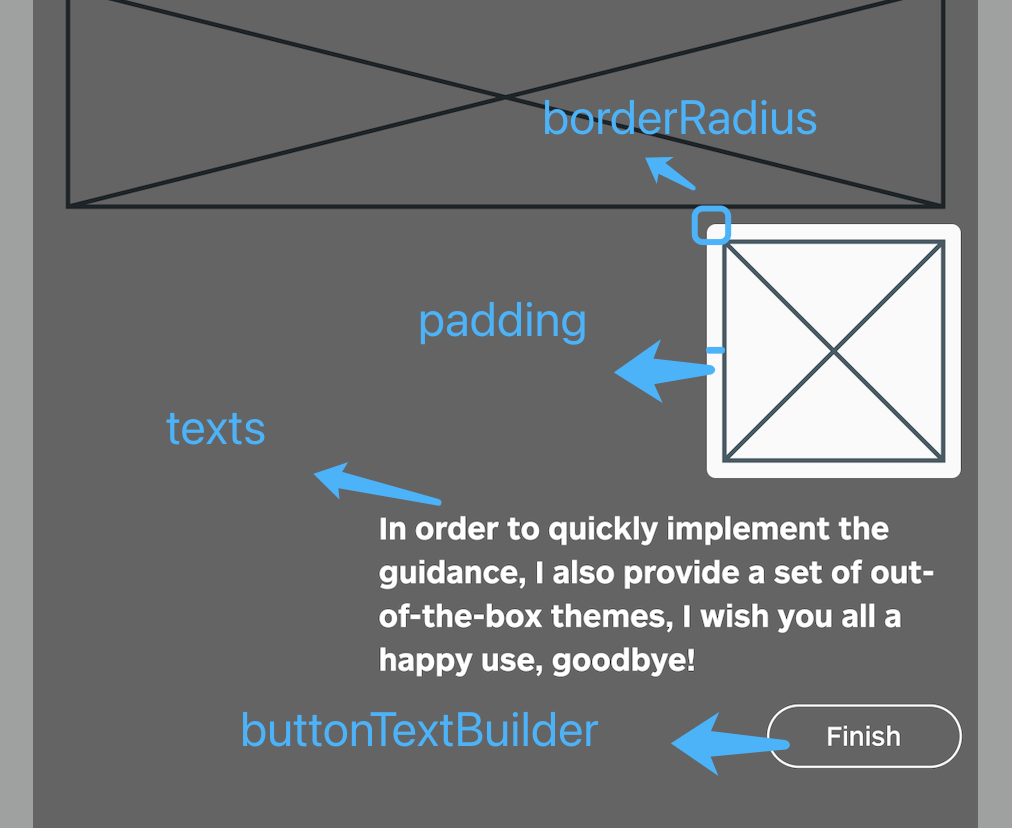
/// The padding of the highlighted area and the widget
- padding: EdgeInsets.all(8),
+ padding: const EdgeInsets.all(8),
/// Border radius of the highlighted area
borderRadius: BorderRadius.all(Radius.circular(4)),
- /// Use the default useDefaultTheme provided by the library to quickly build a guide page
- /// Need to customize the style and content of the guide page, implement the widgetBuilder method yourself
- /// * Above version 2.3.0, you can use useAdvancedTheme to have more control over the style of the widget
- /// * Please see https://github.com/tal-tech/flutter_intro/issues/26
- widgetBuilder: StepWidgetBuilder.useDefaultTheme(
- /// Guide page text
- texts: [
- 'Hello, I\'m Flutter Intro.',
- 'I can help you quickly implement the Step By Step guide in the Flutter project.',
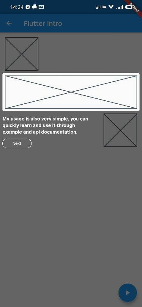
- 'My usage is also very simple, you can quickly learn and use it through example and api documentation.',
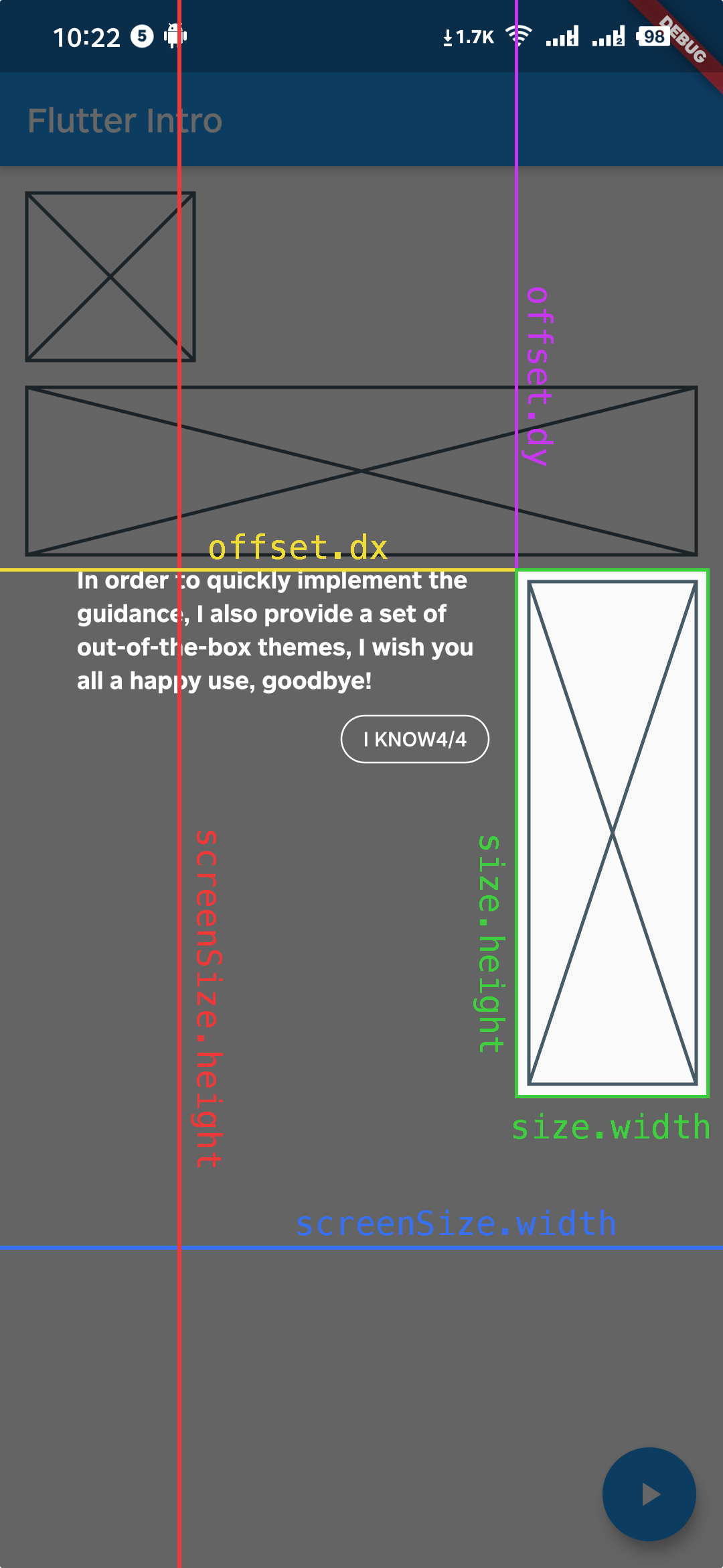
- 'In order to quickly implement the guidance, I also provide a set of out-of-the-box themes, I wish you all a happy use, goodbye!',
- ],
- /// Button text
- buttonTextBuilder: (curr, total) {
- return curr < total - 1 ? 'Next' : 'Finish';
- },
- ),
-);
-```
-
## Usage
@@ -18,159 +22,121 @@ To use this package, add `flutter_intro` as a [dependency in your pubspec.yaml f
### Init
+Wrap the app root widget with `Intro`, also you can set some global properties on `Intro`.
+
```dart
import 'package:flutter_intro/flutter_intro.dart';
-Intro intro = Intro(
- /// You can set it true to disable animation
- noAnimation: false,
-
- /// The total number of guide pages, must be passed
- stepCount: 4,
-
- /// Click on whether the mask is allowed to be closed.
- maskClosable: true,
-
- /// When highlight widget is tapped.
- onHighlightWidgetTap: (introStatus) {
- print(introStatus);
- },
-
+Intro(
/// The padding of the highlighted area and the widget
- padding: EdgeInsets.all(8),
+ padding: const EdgeInsets.all(8),
/// Border radius of the highlighted area
borderRadius: BorderRadius.all(Radius.circular(4)),
- /// Use the default useDefaultTheme provided by the library to quickly build a guide page
- /// Need to customize the style and content of the guide page, implement the widgetBuilder method yourself
- /// * Above version 2.3.0, you can use useAdvancedTheme to have more control over the style of the widget
- /// * Please see https://github.com/tal-tech/flutter_intro/issues/26
- widgetBuilder: StepWidgetBuilder.useDefaultTheme(
- /// Guide page text
- texts: [
- 'Hello, I\'m Flutter Intro.',
- 'I can help you quickly implement the Step By Step guide in the Flutter project.',
- 'My usage is also very simple, you can quickly learn and use it through example and api documentation.',
- 'In order to quickly implement the guidance, I also provide a set of out-of-the-box themes, I wish you all a happy use, goodbye!',
- ],
- /// Button text
- buttonTextBuilder: (curr, total) {
- return curr < total - 1 ? 'Next' : 'Finish';
- },
- ),
-);
-```
- + /// The mask color of step page
+ maskColor: const Color.fromRGBO(0, 0, 0, .6);
-### Bind globalKey to widgets that need to be guided
+ /// No animation
+ noAnimation: false;
-The `intro` object in the first step contains the `keys` property, and `keys` is a `globalKey` array of length `stepCount`. Just bind the `globalKey` in the array to the corresponding component.
+ /// Click on whether the mask is allowed to be closed.
+ maskClosable: false;
-```dart
-Placeholder(
- /// the first guide page is the first item in the binding keys
- key: intro.keys[0]
+ /// Custom button text
+ buttonTextBuilder: (order) =>
+ order == 3 ? 'Custom Button Text' : 'Next',
+
+ child: const YourApp(),
)
```
-### Run
+### Add guided widget
-That's it!
+This time, the `IntroStepBuilder` class is added to do this, which solves the problem that the previous version could not dynamically add a guide.
```dart
-intro.start(context);
+IntroStepBuilder(
+ /// Guide order, can not be repeated with other
+ order: 1,
+ /// At least one of text and overlayBuilder
+ /// Use text to quickly add leading text
+ text: 'guide text',
+ /// Using overlayBuilder can be more customized, please refer to advanced usage in example
+ overlayBuilder: (params) {
+ ///
+ }
+ /// You can specify configuration for individual guide here
+ borderRadius: const BorderRadius.all(Radius.circular(64)),
+ builder: (context, key) => NeedGuideWidget(
+ /// You should bind key here.
+ key: key,
+ ),
+)
```
-## Custom widgetBuilder method
+
+ /// The mask color of step page
+ maskColor: const Color.fromRGBO(0, 0, 0, .6);
-### Bind globalKey to widgets that need to be guided
+ /// No animation
+ noAnimation: false;
-The `intro` object in the first step contains the `keys` property, and `keys` is a `globalKey` array of length `stepCount`. Just bind the `globalKey` in the array to the corresponding component.
+ /// Click on whether the mask is allowed to be closed.
+ maskClosable: false;
-```dart
-Placeholder(
- /// the first guide page is the first item in the binding keys
- key: intro.keys[0]
+ /// Custom button text
+ buttonTextBuilder: (order) =>
+ order == 3 ? 'Custom Button Text' : 'Next',
+
+ child: const YourApp(),
)
```
-### Run
+### Add guided widget
-That's it!
+This time, the `IntroStepBuilder` class is added to do this, which solves the problem that the previous version could not dynamically add a guide.
```dart
-intro.start(context);
+IntroStepBuilder(
+ /// Guide order, can not be repeated with other
+ order: 1,
+ /// At least one of text and overlayBuilder
+ /// Use text to quickly add leading text
+ text: 'guide text',
+ /// Using overlayBuilder can be more customized, please refer to advanced usage in example
+ overlayBuilder: (params) {
+ ///
+ }
+ /// You can specify configuration for individual guide here
+ borderRadius: const BorderRadius.all(Radius.circular(64)),
+ builder: (context, key) => NeedGuideWidget(
+ /// You should bind key here.
+ key: key,
+ ),
+)
```
-## Custom widgetBuilder method
+ +
+### Run
-If you need to completely customize the style and content of the guide page, you need to implement the `widgetBuilder` method yourself.
+That's it!
```dart
-final Widget Function(StepWidgetParams params) widgetBuilder;
+Intro.of(context).start();
```
-This method will be called internally by `flutter_intro` when the intro page appears,
-and will pass some data on the current page in the form of parameters `StepWidgetParams`,
-and finally render the component returned by this method on the screen.
+## Advanced Usage
```dart
-class StepWidgetParams {
- /// Return to the previous guide page method, or null if there is none
- final VoidCallback onPrev;
-
- /// Enter the next guide page method, or null if there is no
- final VoidCallback onNext;
-
- /// End all guide page methods
- final VoidCallback onFinish;
-
- /// Which guide page is currently displayed, starting from 0
- final int currentStepIndex;
-
- /// Total number of guide pages
- final int stepCount;
-
- /// The width and height of the screen
- final Size screenSize;
-
- /// The width and height of the highlighted component
- final Size size;
-
- /// The coordinates of the upper left corner of the highlighted component
- final Offset offset;
-}
+IntroStepBuilder(
+ ...,
+ overlayBuilder: (StepWidgetParams params) {
+ return YourOverlay();
+ },
+)
```
-
+
+### Run
-If you need to completely customize the style and content of the guide page, you need to implement the `widgetBuilder` method yourself.
+That's it!
```dart
-final Widget Function(StepWidgetParams params) widgetBuilder;
+Intro.of(context).start();
```
-This method will be called internally by `flutter_intro` when the intro page appears,
-and will pass some data on the current page in the form of parameters `StepWidgetParams`,
-and finally render the component returned by this method on the screen.
+## Advanced Usage
```dart
-class StepWidgetParams {
- /// Return to the previous guide page method, or null if there is none
- final VoidCallback onPrev;
-
- /// Enter the next guide page method, or null if there is no
- final VoidCallback onNext;
-
- /// End all guide page methods
- final VoidCallback onFinish;
-
- /// Which guide page is currently displayed, starting from 0
- final int currentStepIndex;
-
- /// Total number of guide pages
- final int stepCount;
-
- /// The width and height of the screen
- final Size screenSize;
-
- /// The width and height of the highlighted component
- final Size size;
-
- /// The coordinates of the upper left corner of the highlighted component
- final Offset offset;
-}
+IntroStepBuilder(
+ ...,
+ overlayBuilder: (StepWidgetParams params) {
+ return YourOverlay();
+ },
+)
```
- +
+ -`StepWidgetParams` provides all the parameters needed to generate the guide page.
-The theme provided by default is also based on this parameter to generate the guide page.
+`StepWidgetParams` provides all the parameters needed to generate the guide overlay.
## Troubleshoot
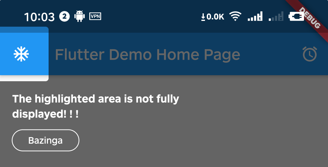
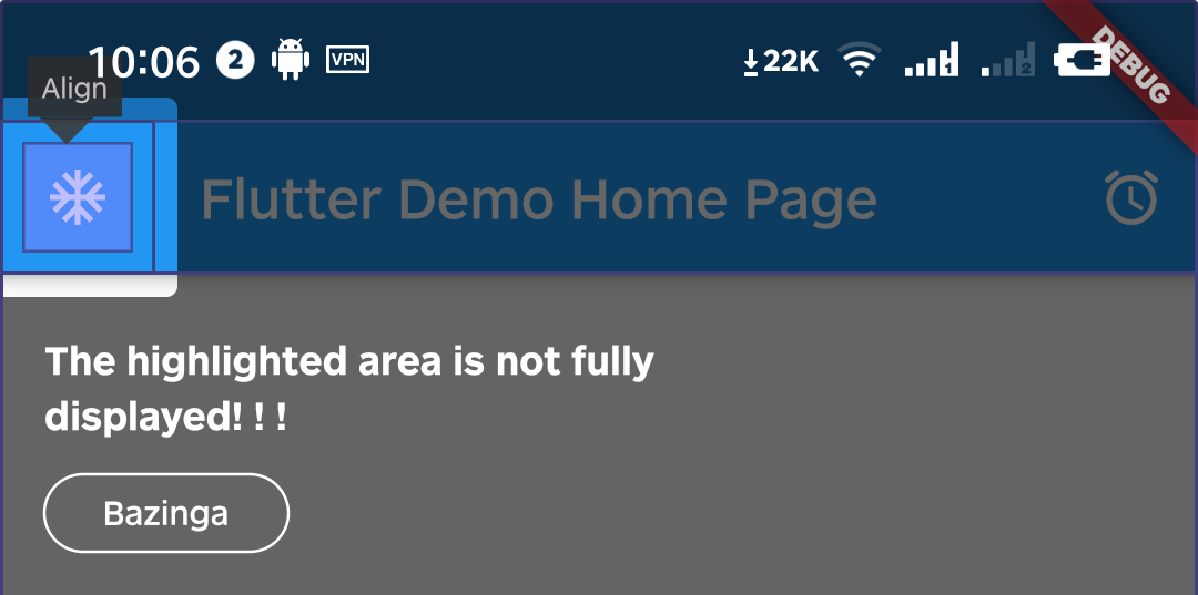
Q1. What if the highlighted area is not displayed completely?
-
-`StepWidgetParams` provides all the parameters needed to generate the guide page.
-The theme provided by default is also based on this parameter to generate the guide page.
+`StepWidgetParams` provides all the parameters needed to generate the guide overlay.
## Troubleshoot
Q1. What if the highlighted area is not displayed completely?
- +
+ A1. That's because Intro provides 8px padding by default.
-
A1. That's because Intro provides 8px padding by default.
- +
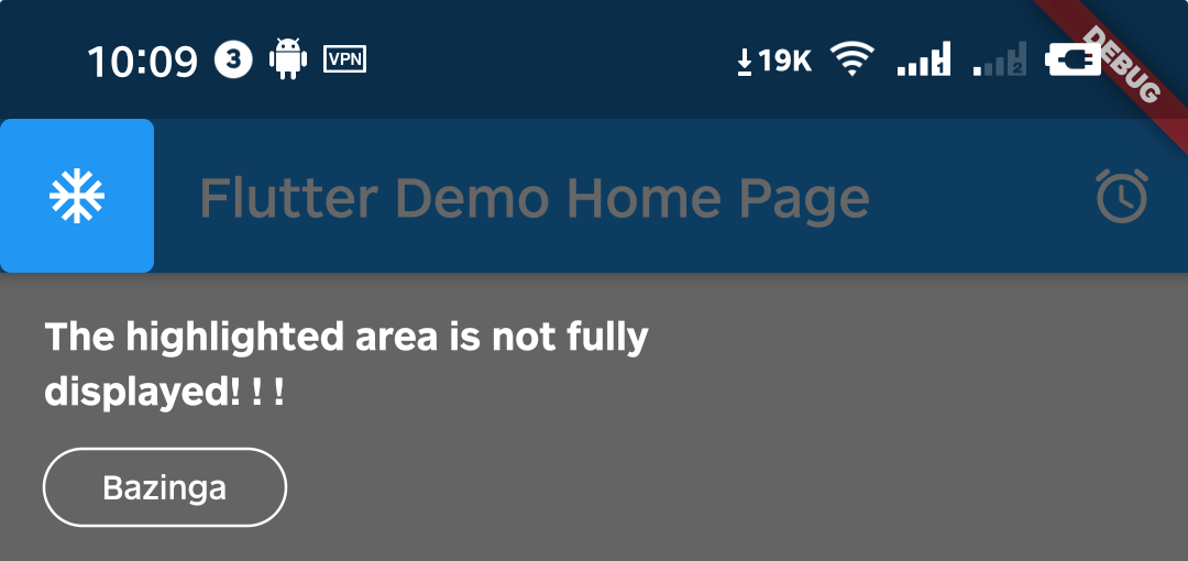
+ We can change it by setting the value of padding.
```dart
-intro = Intro(
+Intro(
...,
/// Set it to zero
padding: EdgeInsets.zero,
+ child: const YourApp(),
);
```
-
We can change it by setting the value of padding.
```dart
-intro = Intro(
+Intro(
...,
/// Set it to zero
padding: EdgeInsets.zero,
+ child: const YourApp(),
);
```
- +
+
Q2. Can I set different configurations for each step?
-A2. Above version `0.4.x`, you can set single or multiple step settings(padding & borderRadius) through setStepConfig and setStepsConfig.
-
+A2. Yes, you can set in every `IntroStepBuilder`.
```dart
-intro.setStepConfig(
- 1,
- padding: EdgeInsets.symmetric(
+IntroStepBuilder(
+ ...,
+ padding: const EdgeInsets.symmetric(
vertical: -5,
- horizontal: -8,
- ),
-);
-
-intro.setStepsConfig(
- [0, 1],
- borderRadius: BorderRadius.all(
- Radius.circular(
- 16,
- ),
+ horizontal: -5,
),
-);
+ borderRadius: const BorderRadius.all(Radius.circular(64)),
+ builder: (context, key) => YourWidget(),
+)
```
@@ -180,32 +146,30 @@ Q3. Can I make the highlight area smaller?
A3. You can do it by setting padding to a negative number.
```dart
-intro.setStepConfig(
- 1,
- padding: EdgeInsets.symmetric(
- vertical: -10,
- horizontal: -8,
+IntroStepBuilder(
+ ...,
+ padding: const EdgeInsets.symmetric(
+ vertical: -5,
+ horizontal: -5,
),
-);
+ builder: (context, key) => YourWidget(),
+)
```
- +
+
Q4. How can I manually destroy the guide page, such as the user pressing the back button?
-A4. Above version `0.5.x`, you can call the dispose method of the intro instance.
-
-Notice: You can call the getStatus method only above version `2.1.0`.
+A4. You can call the dispose method of the intro instance.
```dart
WillPopScope(
child: Scaffold(...),
onWillPop: () async {
- // sometimes you need get current status to make some judgements
- IntroStatus introStatus = intro.getStatus();
- if (introStatus.isOpen) {
- // destroy guide page when tap back key
+ Intro intro = Intro.of(context);
+
+ if (intro.status.isOpen == true) {
intro.dispose();
return false;
}
@@ -214,14 +178,6 @@ WillPopScope(
)
```
-
-
-Q5: How to use in the web environment?
-
-A5: Due to [this bug](https://github.com/flutter/flutter/issues/69849) in Flutter, it is temporarily not supported for use on the Web.(Update: It works in Flutter 2.0+)
-
- -
## Example
Please check the example in `example/lib/main.dart`.
diff --git a/README_V2.md b/README_V2.md
new file mode 100644
index 0000000..86c89f8
--- /dev/null
+++ b/README_V2.md
@@ -0,0 +1,226 @@
+# flutter_intro
+
+[](https://pub.dartlang.org/packages/flutter_intro)
+
+A better way for new feature introduction and step-by-step users guide for your Flutter project.
+
+
-
## Example
Please check the example in `example/lib/main.dart`.
diff --git a/README_V2.md b/README_V2.md
new file mode 100644
index 0000000..86c89f8
--- /dev/null
+++ b/README_V2.md
@@ -0,0 +1,226 @@
+# flutter_intro
+
+[](https://pub.dartlang.org/packages/flutter_intro)
+
+A better way for new feature introduction and step-by-step users guide for your Flutter project.
+
+ +
+Automatically adapt when the device screen orientation is switched.
+
+
+
+## Usage
+
+To use this package, add `flutter_intro` as a [dependency in your pubspec.yaml file](https://flutter.dev/docs/development/packages-and-plugins/using-packages).
+
+### Init
+
+```dart
+import 'package:flutter_intro/flutter_intro.dart';
+
+Intro intro = Intro(
+ /// You can set it true to disable animation
+ noAnimation: false,
+
+ /// The total number of guide pages, must be passed
+ stepCount: 4,
+
+ /// Click on whether the mask is allowed to be closed.
+ maskClosable: true,
+
+ /// When highlight widget is tapped.
+ onHighlightWidgetTap: (introStatus) {
+ print(introStatus);
+ },
+
+ /// The padding of the highlighted area and the widget
+ padding: EdgeInsets.all(8),
+
+ /// Border radius of the highlighted area
+ borderRadius: BorderRadius.all(Radius.circular(4)),
+
+ /// Use the default useDefaultTheme provided by the library to quickly build a guide page
+ /// Need to customize the style and content of the guide page, implement the widgetBuilder method yourself
+ /// * Above version 2.3.0, you can use useAdvancedTheme to have more control over the style of the widget
+ /// * Please see https://github.com/minaxorg/flutter_intro/issues/26
+ widgetBuilder: StepWidgetBuilder.useDefaultTheme(
+ /// Guide page text
+ texts: [
+ 'Hello, I\'m Flutter Intro.',
+ 'I can help you quickly implement the Step By Step guide in the Flutter project.',
+ 'My usage is also very simple, you can quickly learn and use it through example and api documentation.',
+ 'In order to quickly implement the guidance, I also provide a set of out-of-the-box themes, I wish you all a happy use, goodbye!',
+ ],
+ /// Button text
+ buttonTextBuilder: (curr, total) {
+ return curr < total - 1 ? 'Next' : 'Finish';
+ },
+ ),
+);
+```
+
+
+Automatically adapt when the device screen orientation is switched.
+
+
+
+## Usage
+
+To use this package, add `flutter_intro` as a [dependency in your pubspec.yaml file](https://flutter.dev/docs/development/packages-and-plugins/using-packages).
+
+### Init
+
+```dart
+import 'package:flutter_intro/flutter_intro.dart';
+
+Intro intro = Intro(
+ /// You can set it true to disable animation
+ noAnimation: false,
+
+ /// The total number of guide pages, must be passed
+ stepCount: 4,
+
+ /// Click on whether the mask is allowed to be closed.
+ maskClosable: true,
+
+ /// When highlight widget is tapped.
+ onHighlightWidgetTap: (introStatus) {
+ print(introStatus);
+ },
+
+ /// The padding of the highlighted area and the widget
+ padding: EdgeInsets.all(8),
+
+ /// Border radius of the highlighted area
+ borderRadius: BorderRadius.all(Radius.circular(4)),
+
+ /// Use the default useDefaultTheme provided by the library to quickly build a guide page
+ /// Need to customize the style and content of the guide page, implement the widgetBuilder method yourself
+ /// * Above version 2.3.0, you can use useAdvancedTheme to have more control over the style of the widget
+ /// * Please see https://github.com/minaxorg/flutter_intro/issues/26
+ widgetBuilder: StepWidgetBuilder.useDefaultTheme(
+ /// Guide page text
+ texts: [
+ 'Hello, I\'m Flutter Intro.',
+ 'I can help you quickly implement the Step By Step guide in the Flutter project.',
+ 'My usage is also very simple, you can quickly learn and use it through example and api documentation.',
+ 'In order to quickly implement the guidance, I also provide a set of out-of-the-box themes, I wish you all a happy use, goodbye!',
+ ],
+ /// Button text
+ buttonTextBuilder: (curr, total) {
+ return curr < total - 1 ? 'Next' : 'Finish';
+ },
+ ),
+);
+```
+ +
+### Bind globalKey to widgets that need to be guided
+
+The `intro` object in the first step contains the `keys` property, and `keys` is a `globalKey` array of length `stepCount`. Just bind the `globalKey` in the array to the corresponding component.
+
+```dart
+Placeholder(
+ /// the first guide page is the first item in the binding keys
+ key: intro.keys[0]
+)
+```
+
+### Run
+
+That's it!
+
+```dart
+intro.start(context);
+```
+
+## Custom widgetBuilder method
+
+If you need to completely customize the style and content of the guide page, you need to implement the `widgetBuilder` method yourself.
+
+```dart
+final Widget Function(StepWidgetParams params) widgetBuilder;
+```
+
+This method will be called internally by `flutter_intro` when the intro page appears,
+and will pass some data on the current page in the form of parameters `StepWidgetParams`,
+and finally render the component returned by this method on the screen.
+
+```dart
+class StepWidgetParams {
+ /// Return to the previous guide page method, or null if there is none
+ final VoidCallback onPrev;
+
+ /// Enter the next guide page method, or null if there is no
+ final VoidCallback onNext;
+
+ /// End all guide page methods
+ final VoidCallback onFinish;
+
+ /// Which guide page is currently displayed, starting from 0
+ final int currentStepIndex;
+
+ /// Total number of guide pages
+ final int stepCount;
+
+ /// The width and height of the screen
+ final Size screenSize;
+
+ /// The width and height of the highlighted component
+ final Size size;
+
+ /// The coordinates of the upper left corner of the highlighted component
+ final Offset offset;
+}
+```
+
+
+
+`StepWidgetParams` provides all the parameters needed to generate the guide page.
+The theme provided by default is also based on this parameter to generate the guide page.
+
+## Troubleshoot
+
+Q1. What if the highlighted area is not displayed completely?
+
+
+
+A1. That's because Intro provides 8px padding by default.
+
+
+
+We can change it by setting the value of padding.
+
+```dart
+intro = Intro(
+ ...,
+ /// Set it to zero
+ padding: EdgeInsets.zero,
+);
+```
+
+
+
+
+Q2. Can I set different configurations for each step?
+
+A2. Above version `0.4.x`, you can set single or multiple step settings(padding & borderRadius) through setStepConfig and setStepsConfig.
+
+```dart
+intro.setStepConfig(
+ 1,
+ padding: EdgeInsets.symmetric(
+ vertical: -5,
+ horizontal: -8,
+ ),
+);
+
+intro.setStepsConfig(
+ [0, 1],
+ borderRadius: BorderRadius.all(
+ Radius.circular(
+ 16,
+ ),
+ ),
+);
+```
+
+
+
+Q3. Can I make the highlight area smaller?
+
+A3. You can do it by setting padding to a negative number.
+
+```dart
+intro.setStepConfig(
+ 1,
+ padding: EdgeInsets.symmetric(
+ vertical: -10,
+ horizontal: -8,
+ ),
+);
+```
+
+
+
+
+Q4. How can I manually destroy the guide page, such as the user pressing the back button?
+
+A4. Above version `0.5.x`, you can call the dispose method of the intro instance.
+
+Notice: You can call the getStatus method only above version `2.1.0`.
+
+```dart
+WillPopScope(
+ child: Scaffold(...),
+ onWillPop: () async {
+ // sometimes you need get current status to make some judgements
+ IntroStatus introStatus = intro.getStatus();
+ if (introStatus.isOpen) {
+ // destroy guide page when tap back key
+ intro.dispose();
+ return false;
+ }
+ return true;
+ },
+)
+```
+
+
+
+Q5: How to use in the web environment?
+
+A5: Due to [this bug](https://github.com/flutter/flutter/issues/69849) in Flutter, it is temporarily not supported for use on the Web.(Update: It works in Flutter 2.0+)
+
+ +
+## Example
+
+Please check the example in `example/lib/main.dart`.
+
diff --git a/doc/v3/example1.gif b/doc/v3/example1.gif
new file mode 100644
index 0000000..0e5667e
Binary files /dev/null and b/doc/v3/example1.gif differ
diff --git a/doc/v3/img1.png b/doc/v3/img1.png
new file mode 100644
index 0000000..2ed32d5
Binary files /dev/null and b/doc/v3/img1.png differ
diff --git a/example/lib/advanced_usage.dart b/example/lib/advanced_usage.dart
new file mode 100644
index 0000000..4afa5c6
--- /dev/null
+++ b/example/lib/advanced_usage.dart
@@ -0,0 +1,176 @@
+import 'package:flutter/material.dart';
+import 'package:flutter_intro/flutter_intro.dart';
+
+class AdvancedUsage extends StatefulWidget {
+ const AdvancedUsage({Key? key}) : super(key: key);
+
+ @override
+ State createState() => _AdvancedUsageState();
+}
+
+class _AdvancedUsageState extends State {
+ bool rendered = false;
+
+ @override
+ Widget build(BuildContext context) {
+ return WillPopScope(
+ onWillPop: () async {
+ Intro intro = Intro.of(context);
+
+ if (intro.status.isOpen == true) {
+ intro.dispose();
+ return false;
+ }
+ return true;
+ },
+ child: Scaffold(
+ appBar: AppBar(),
+ body: SingleChildScrollView(
+ child: Container(
+ padding: const EdgeInsets.all(16),
+ child: Column(
+ crossAxisAlignment: CrossAxisAlignment.start,
+ children: [
+ IntroStepBuilder(
+ /// 2nd guide
+ order: 2,
+ overlayBuilder: (params) {
+ return Container(
+ color: Colors.teal,
+ padding: const EdgeInsets.all(16),
+ child: Column(
+ children: [
+ params.onNext == null
+ ? Column(
+ children: const [
+ Text(
+ 'Of course, you can also render what you want through overlayBuilder.',
+ style: TextStyle(height: 1.6),
+ ),
+ Text(
+ 'In addition, we can finally add new guide widget dynamically.',
+ style: TextStyle(height: 1.6),
+ ),
+ Text(
+ 'Click highlight area to add new widget.',
+ style: TextStyle(height: 1.6),
+ )
+ ],
+ )
+ : const Text(
+ 'As you can see, you can move on to the next step'),
+ Padding(
+ padding: const EdgeInsets.only(
+ top: 16,
+ ),
+ child: Row(
+ children: [
+ IntroButton(
+ text: 'Prev',
+ onPressed: params.onPrev,
+ ),
+ IntroButton(
+ text: 'Next',
+ onPressed: params.onNext,
+ ),
+ ],
+ ),
+ ),
+ ],
+ ),
+ );
+ },
+ onHighlightWidgetTap: () {
+ setState(() {
+ rendered = true;
+ });
+ },
+ builder: (context, key) => Row(
+ mainAxisAlignment: MainAxisAlignment.end,
+ children: [
+ Placeholder(
+ key: key,
+ fallbackWidth: 100,
+ fallbackHeight: 100,
+ ),
+ ],
+ ),
+ ),
+ const SizedBox(
+ height: 16,
+ ),
+ rendered
+ ? IntroStepBuilder(
+ order: 3,
+ onWidgetLoad: () {
+ Intro.of(context).refresh();
+ },
+ overlayBuilder: (params) {
+ return Container(
+ padding: const EdgeInsets.all(16),
+ color: Colors.teal,
+ child: Column(
+ children: [
+ const Text(
+ 'That\'s it, hopefully version 3.0 makes you feel better than 2.0',
+ ),
+ Padding(
+ padding: const EdgeInsets.only(
+ top: 16,
+ ),
+ child: Row(
+ children: [
+ IntroButton(
+ onPressed: params.onPrev,
+ text: 'Prev',
+ ),
+ IntroButton(
+ onPressed: params.onNext,
+ text: 'Next',
+ ),
+ IntroButton(
+ onPressed: params.onFinish,
+ text: 'Finish',
+ ),
+ ],
+ ),
+ ),
+ ],
+ ),
+ );
+ },
+ builder: (context, key) => Text(
+ 'I am a delay render widget.',
+ key: key,
+ ),
+ )
+ : const SizedBox.shrink(),
+ ],
+ ),
+ ),
+ ),
+ floatingActionButton: IntroStepBuilder(
+ /// 1st guide
+ order: 1,
+ text:
+ 'Some properties on IntroStepBuilder like `borderRadius` `padding`'
+ ' allow you to configure the configuration of this step.',
+ padding: const EdgeInsets.symmetric(
+ vertical: -5,
+ horizontal: -5,
+ ),
+ borderRadius: const BorderRadius.all(Radius.circular(64)),
+ builder: (context, key) => FloatingActionButton(
+ key: key,
+ child: const Icon(
+ Icons.play_arrow,
+ ),
+ onPressed: () {
+ Intro.of(context).start();
+ },
+ ),
+ ),
+ ),
+ );
+ }
+}
diff --git a/example/lib/demo_usage.dart b/example/lib/demo_usage.dart
new file mode 100644
index 0000000..82e8588
--- /dev/null
+++ b/example/lib/demo_usage.dart
@@ -0,0 +1,82 @@
+import 'package:flutter/material.dart';
+import 'package:flutter_intro/flutter_intro.dart';
+
+class DemoUsage extends StatefulWidget {
+ const DemoUsage({Key? key}) : super(key: key);
+
+ @override
+ State createState() => _DemoUsageState();
+}
+
+class _DemoUsageState extends State {
+ @override
+ Widget build(BuildContext context) {
+ return Scaffold(
+ appBar: AppBar(),
+ body: Padding(
+ padding: const EdgeInsets.all(16),
+ child: Column(
+ crossAxisAlignment: CrossAxisAlignment.start,
+ children: [
+ SizedBox(
+ width: 100,
+ child: IntroStepBuilder(
+ order: 2,
+ text:
+ 'I can help you quickly implement the Step By Step guide in the Flutter project.',
+ builder: (context, key) => Placeholder(
+ key: key,
+ fallbackHeight: 100,
+ ),
+ ),
+ ),
+ const SizedBox(
+ height: 16,
+ ),
+ IntroStepBuilder(
+ order: 3,
+ text:
+ 'My usage is also very simple, you can quickly learn and use it through example and api documentation.',
+ builder: (context, key) => Placeholder(
+ key: key,
+ fallbackHeight: 100,
+ ),
+ ),
+ ],
+ ),
+ ),
+ bottomNavigationBar: BottomNavigationBar(
+ items: [
+ BottomNavigationBarItem(
+ label: 'Home',
+ icon: IntroStepBuilder(
+ order: 1,
+ text: 'Welcome to flutter_intro',
+ padding: const EdgeInsets.only(
+ bottom: 20,
+ left: 16,
+ right: 16,
+ top: 8,
+ ),
+ onWidgetLoad: () {
+ Intro.of(context).start();
+ },
+ builder: (context, key) => Icon(
+ Icons.home,
+ key: key,
+ ),
+ ),
+ ),
+ const BottomNavigationBarItem(
+ label: 'Book',
+ icon: Icon(Icons.book),
+ ),
+ const BottomNavigationBarItem(
+ label: 'School',
+ icon: Icon(Icons.school),
+ ),
+ ],
+ ),
+ );
+ }
+}
diff --git a/example/lib/main.dart b/example/lib/main.dart
index e5cdb2e..963bb45 100644
--- a/example/lib/main.dart
+++ b/example/lib/main.dart
@@ -1,7 +1,8 @@
-import 'dart:async';
-
import 'package:flutter/material.dart';
import 'package:flutter_intro/flutter_intro.dart';
+import 'package:intro/advanced_usage.dart';
+import 'package:intro/demo_usage.dart';
+import 'package:intro/simple_usage.dart';
void main() {
runApp(const MyApp());
@@ -36,48 +37,45 @@ class StartPage extends StatelessWidget {
mainAxisSize: MainAxisSize.min,
children: [
ElevatedButton(
- child: const Text('Start with useDefaultTheme'),
onPressed: () {
Navigator.push(
context,
MaterialPageRoute(
- builder: (BuildContext context) => const MyHomePage(
- title: 'Flutter Intro',
- mode: Mode.defaultTheme,
+ builder: (BuildContext context) => Intro(
+ padding: EdgeInsets.zero,
+ borderRadius: const BorderRadius.all(Radius.circular(4)),
+ maskColor: const Color.fromRGBO(0, 0, 0, .6),
+ child: const DemoUsage(),
),
),
);
},
- ),
- const SizedBox(
- height: 16,
+ child: const Text('Demo'),
),
ElevatedButton(
- child: const Text('Start with useAdvancedTheme'),
onPressed: () {
Navigator.push(
context,
MaterialPageRoute(
- builder: (BuildContext context) => const MyHomePage(
- title: 'Flutter Intro',
- mode: Mode.advancedTheme,
+ builder: (BuildContext context) => Intro(
+ buttonTextBuilder: (order) =>
+ order == 3 ? 'Custom Button Text' : 'Next',
+ child: const SimpleUsage(),
),
),
);
},
- ),
- const SizedBox(
- height: 16,
+ child: const Text('Simple Usage'),
),
ElevatedButton(
- child: const Text('Start with customTheme'),
+ child: const Text('Advanced Usage'),
onPressed: () {
Navigator.push(
context,
MaterialPageRoute(
- builder: (BuildContext context) => const MyHomePage(
- title: 'Flutter Intro',
- mode: Mode.customTheme,
+ builder: (BuildContext context) => Intro(
+ maskClosable: true,
+ child: const AdvancedUsage(),
),
),
);
@@ -89,263 +87,3 @@ class StartPage extends StatelessWidget {
);
}
}
-
-enum Mode {
- defaultTheme,
- customTheme,
- advancedTheme,
-}
-
-class MyHomePage extends StatefulWidget {
- const MyHomePage({
- Key? key,
- required this.title,
- required this.mode,
- }) : super(key: key);
-
- final String title;
-
- final Mode mode;
-
- @override
- _MyHomePageState createState() => _MyHomePageState();
-}
-
-class _MyHomePageState extends State {
- late Intro intro;
-
- Widget customThemeWidgetBuilder(StepWidgetParams stepWidgetParams) {
- List texts = [
- 'Hello, I\'m Flutter Intro.',
- 'I can help you quickly implement the Step By Step guide in the Flutter project.',
- 'My usage is also very simple, you can quickly learn and use it through example and api documentation.',
- 'In order to quickly implement the guidance, I also provide a set of out-of-the-box themes, I wish you all a happy use, goodbye!',
- ];
- return Padding(
- padding: const EdgeInsets.all(
- 32,
- ),
- child: Column(
- children: [
- const SizedBox(
- height: 40,
- ),
- Text(
- '${texts[stepWidgetParams.currentStepIndex]}【${stepWidgetParams.currentStepIndex + 1} / ${stepWidgetParams.stepCount}】',
- style: const TextStyle(
- color: Colors.white,
- fontSize: 16,
- ),
- ),
- Row(
- children: [
- ElevatedButton(
- onPressed: stepWidgetParams.onPrev,
- child: const Text(
- 'Prev',
- ),
- ),
- const SizedBox(
- width: 16,
- ),
- ElevatedButton(
- onPressed: stepWidgetParams.onNext,
- child: const Text(
- 'Next',
- ),
- ),
- const SizedBox(
- width: 16,
- ),
- ElevatedButton(
- onPressed: stepWidgetParams.onFinish,
- child: const Text(
- 'Finish',
- ),
- ),
- ],
- ),
- ],
- ),
- );
- }
-
- @override
- void initState() {
- super.initState();
- if (widget.mode == Mode.defaultTheme) {
- /// init Intro
- intro = Intro(
- stepCount: 4,
- maskClosable: true,
- onHighlightWidgetTap: (introStatus) {
- print(introStatus);
- },
-
- /// use defaultTheme
- widgetBuilder: StepWidgetBuilder.useDefaultTheme(
- texts: [
- 'Hello, I\'m Flutter Intro.',
- 'I can help you quickly implement the Step By Step guide in the Flutter project.',
- 'My usage is also very simple, you can quickly learn and use it through example and api documentation.',
- 'In order to quickly implement the guidance, I also provide a set of out-of-the-box themes, I wish you all a happy use, goodbye!',
- ],
- buttonTextBuilder: (currPage, totalPage) {
- return currPage < totalPage - 1 ? 'Next' : 'Finish';
- },
- ),
- );
- intro.setStepConfig(
- 0,
- borderRadius: BorderRadius.circular(64),
- );
- }
- if (widget.mode == Mode.advancedTheme) {
- /// init Intro
- intro = Intro(
- stepCount: 4,
- maskClosable: false,
- onHighlightWidgetTap: (introStatus) {
- print(introStatus);
- },
-
- /// useAdvancedTheme
- widgetBuilder: StepWidgetBuilder.useAdvancedTheme(
- widgetBuilder: (params) {
- return Container(
- decoration: BoxDecoration(
- color: Colors.red.withOpacity(.6),
- ),
- child: Column(
- children: [
- Text(
- '${params.currentStepIndex + 1}/${params.stepCount}',
- style: const TextStyle(
- color: Colors.green,
- fontSize: 24,
- fontWeight: FontWeight.bold,
- ),
- ),
- Row(
- children: [
- ElevatedButton(
- onPressed: params.onPrev,
- child: const Text('Prev'),
- ),
- ElevatedButton(
- onPressed: params.onNext,
- child: const Text('Next'),
- ),
- ElevatedButton(
- onPressed: params.onFinish,
- child: const Text('Finish'),
- ),
- ],
- ),
- ],
- ),
- );
- },
- ),
- );
- intro.setStepConfig(
- 0,
- borderRadius: BorderRadius.circular(64),
- );
- }
- if (widget.mode == Mode.customTheme) {
- /// init Intro
- intro = Intro(
- stepCount: 4,
-
- maskClosable: true,
-
- /// implement widgetBuilder function
- widgetBuilder: customThemeWidgetBuilder,
- );
- }
-
- Timer(
- const Duration(
- milliseconds: 500,
- ),
- () {
- /// start the intro
- intro.start(context);
- },
- );
- }
-
- @override
- Widget build(BuildContext context) {
- return WillPopScope(
- child: Scaffold(
- appBar: AppBar(
- title: Text(widget.title),
- ),
- body: SingleChildScrollView(
- child: Container(
- padding: const EdgeInsets.all(16),
- child: Column(
- crossAxisAlignment: CrossAxisAlignment.start,
- children: [
- SizedBox(
- width: 100,
- child: Placeholder(
- /// 2nd guide
- key: intro.keys[1],
- fallbackHeight: 100,
- ),
- ),
- const SizedBox(
- height: 16,
- ),
- Placeholder(
- /// 3rd guide
- key: intro.keys[2],
- fallbackHeight: 100,
- ),
- const SizedBox(
- height: 16,
- ),
- Row(
- mainAxisAlignment: MainAxisAlignment.end,
- children: [
- SizedBox(
- width: 100,
- child: Placeholder(
- /// 4th guide
- key: intro.keys[3],
- fallbackHeight: 100,
- ),
- ),
- ],
- ),
- ],
- ),
- ),
- ),
- floatingActionButton: FloatingActionButton(
- /// 1st guide
- key: intro.keys[0],
- child: const Icon(
- Icons.play_arrow,
- ),
- onPressed: () {
- intro.start(context);
- },
- ),
- ),
- onWillPop: () async {
- // sometimes you need get current status
- IntroStatus introStatus = intro.getStatus();
- if (introStatus.isOpen) {
- // destroy guide page when tap back key
- intro.dispose();
- return false;
- }
- return true;
- },
- );
- }
-}
diff --git a/example/lib/simple_usage.dart b/example/lib/simple_usage.dart
new file mode 100644
index 0000000..c9d259d
--- /dev/null
+++ b/example/lib/simple_usage.dart
@@ -0,0 +1,70 @@
+import 'package:flutter/material.dart';
+import 'package:flutter_intro/flutter_intro.dart';
+
+class SimpleUsage extends StatelessWidget {
+ const SimpleUsage({Key? key}) : super(key: key);
+
+ @override
+ Widget build(BuildContext context) {
+ return WillPopScope(
+ child: Scaffold(
+ appBar: AppBar(),
+ body: Padding(
+ padding: const EdgeInsets.all(
+ 16,
+ ),
+ child: Center(
+ child: Column(
+ children: [
+ IntroStepBuilder(
+ order: 2,
+ text:
+ 'Use IntroStepBuilder to wrap the widget you need to guide.'
+ ' Add the necessary order to it, and then add the key in the builder method to the widget.',
+ builder: (context, key) => Text(
+ 'Tap the floatingActionButton to start.',
+ key: key,
+ ),
+ ),
+ const SizedBox(
+ height: 16,
+ ),
+ IntroStepBuilder(
+ order: 3,
+ text:
+ 'If you need more configuration, please refer to Advanced Usage.',
+ builder: (context, key) => Text(
+ 'And you can use `buttonTextBuilder` to set the button text.',
+ key: key,
+ ),
+ ),
+ ],
+ ),
+ ),
+ ),
+ floatingActionButton: IntroStepBuilder(
+ order: 1,
+ text: 'OK, let\'s start.',
+ builder: (context, key) => FloatingActionButton(
+ key: key,
+ child: const Icon(
+ Icons.play_arrow,
+ ),
+ onPressed: () {
+ Intro.of(context).start();
+ },
+ ),
+ ),
+ ),
+ onWillPop: () async {
+ Intro intro = Intro.of(context);
+
+ if (intro.status.isOpen == true) {
+ intro.dispose();
+ return false;
+ }
+ return true;
+ },
+ );
+ }
+}
diff --git a/example/pubspec.lock b/example/pubspec.lock
index 165f9eb..512e786 100644
--- a/example/pubspec.lock
+++ b/example/pubspec.lock
@@ -42,7 +42,7 @@ packages:
name: collection
url: "https://pub.dartlang.org"
source: hosted
- version: "1.15.0"
+ version: "1.16.0"
cupertino_icons:
dependency: "direct main"
description:
@@ -56,7 +56,7 @@ packages:
name: fake_async
url: "https://pub.dartlang.org"
source: hosted
- version: "1.2.0"
+ version: "1.3.0"
flutter:
dependency: "direct main"
description: flutter
@@ -68,14 +68,14 @@ packages:
path: ".."
relative: true
source: path
- version: "2.3.1"
+ version: "3.0.2"
flutter_lints:
dependency: "direct dev"
description:
name: flutter_lints
url: "https://pub.dartlang.org"
source: hosted
- version: "1.0.4"
+ version: "2.0.1"
flutter_test:
dependency: "direct dev"
description: flutter
@@ -87,7 +87,7 @@ packages:
name: lints
url: "https://pub.dartlang.org"
source: hosted
- version: "1.0.1"
+ version: "2.0.0"
matcher:
dependency: transitive
description:
@@ -101,7 +101,7 @@ packages:
name: material_color_utilities
url: "https://pub.dartlang.org"
source: hosted
- version: "0.1.3"
+ version: "0.1.4"
meta:
dependency: transitive
description:
@@ -115,7 +115,7 @@ packages:
name: path
url: "https://pub.dartlang.org"
source: hosted
- version: "1.8.0"
+ version: "1.8.1"
sky_engine:
dependency: transitive
description: flutter
@@ -127,7 +127,7 @@ packages:
name: source_span
url: "https://pub.dartlang.org"
source: hosted
- version: "1.8.1"
+ version: "1.8.2"
stack_trace:
dependency: transitive
description:
@@ -162,21 +162,14 @@ packages:
name: test_api
url: "https://pub.dartlang.org"
source: hosted
- version: "0.4.8"
- typed_data:
- dependency: transitive
- description:
- name: typed_data
- url: "https://pub.dartlang.org"
- source: hosted
- version: "1.3.0"
+ version: "0.4.9"
vector_math:
dependency: transitive
description:
name: vector_math
url: "https://pub.dartlang.org"
source: hosted
- version: "2.1.1"
+ version: "2.1.2"
sdks:
- dart: ">=2.16.1 <3.0.0"
+ dart: ">=2.17.0-206.0.dev <3.0.0"
flutter: ">=1.17.0"
diff --git a/example/pubspec.yaml b/example/pubspec.yaml
index cee5937..d32fef6 100644
--- a/example/pubspec.yaml
+++ b/example/pubspec.yaml
@@ -47,7 +47,7 @@ dev_dependencies:
# activated in the `analysis_options.yaml` file located at the root of your
# package. See that file for information about deactivating specific lint
# rules and activating additional ones.
- flutter_lints: ^1.0.0
+ flutter_lints: ^2.0.1
# For information on the generic Dart part of this file, see the
# following page: https://dart.dev/tools/pub/pubspec
diff --git a/lib/flutter_intro.dart b/lib/flutter_intro.dart
index 83b4c93..1bfbb85 100644
--- a/lib/flutter_intro.dart
+++ b/lib/flutter_intro.dart
@@ -7,163 +7,111 @@ import 'package:flutter/material.dart';
part 'delay_rendered_widget.dart';
part 'flutter_intro_exception.dart';
+part 'intro_button.dart';
part 'intro_status.dart';
+part 'intro_step_builder.dart';
+part 'overlay_position.dart';
part 'step_widget_builder.dart';
part 'step_widget_params.dart';
part 'throttling.dart';
-/// Flutter Intro main class
-///
-/// Pass in [stepCount] when instantiating [Intro] object, and [widgetBuilder]
-/// Obtain [GlobalKey] from [Intro.keys] and add it to the [Widget] where you need to add a guide page
-/// Finally execute the [start] method, the parameter is the current [BuildContext], you can
-///
-/// {@tool snippet}
-/// ```dart
-/// final Intro intro = Intro(
-/// stepCount: 4,
-/// widgetBuilder: widgetBuilder,
-/// );
-///
-/// Container(
-/// key: intro.keys[0],
-/// );
-/// Text(
-/// 'need focus widget',
-/// key: intro.keys[1],
-/// );
-///
-/// intro.start(context);
-/// ```
-/// {@end-tool}
-///
-class Intro {
- bool _removed = false;
- double? _widgetWidth;
- double? _widgetHeight;
- Offset? _widgetOffset;
- OverlayEntry? _overlayEntry;
- int _currentStepIndex = 0;
- Widget? _stepWidget;
- List
+
+## Example
+
+Please check the example in `example/lib/main.dart`.
+
diff --git a/doc/v3/example1.gif b/doc/v3/example1.gif
new file mode 100644
index 0000000..0e5667e
Binary files /dev/null and b/doc/v3/example1.gif differ
diff --git a/doc/v3/img1.png b/doc/v3/img1.png
new file mode 100644
index 0000000..2ed32d5
Binary files /dev/null and b/doc/v3/img1.png differ
diff --git a/example/lib/advanced_usage.dart b/example/lib/advanced_usage.dart
new file mode 100644
index 0000000..4afa5c6
--- /dev/null
+++ b/example/lib/advanced_usage.dart
@@ -0,0 +1,176 @@
+import 'package:flutter/material.dart';
+import 'package:flutter_intro/flutter_intro.dart';
+
+class AdvancedUsage extends StatefulWidget {
+ const AdvancedUsage({Key? key}) : super(key: key);
+
+ @override
+ State createState() => _AdvancedUsageState();
+}
+
+class _AdvancedUsageState extends State {
+ bool rendered = false;
+
+ @override
+ Widget build(BuildContext context) {
+ return WillPopScope(
+ onWillPop: () async {
+ Intro intro = Intro.of(context);
+
+ if (intro.status.isOpen == true) {
+ intro.dispose();
+ return false;
+ }
+ return true;
+ },
+ child: Scaffold(
+ appBar: AppBar(),
+ body: SingleChildScrollView(
+ child: Container(
+ padding: const EdgeInsets.all(16),
+ child: Column(
+ crossAxisAlignment: CrossAxisAlignment.start,
+ children: [
+ IntroStepBuilder(
+ /// 2nd guide
+ order: 2,
+ overlayBuilder: (params) {
+ return Container(
+ color: Colors.teal,
+ padding: const EdgeInsets.all(16),
+ child: Column(
+ children: [
+ params.onNext == null
+ ? Column(
+ children: const [
+ Text(
+ 'Of course, you can also render what you want through overlayBuilder.',
+ style: TextStyle(height: 1.6),
+ ),
+ Text(
+ 'In addition, we can finally add new guide widget dynamically.',
+ style: TextStyle(height: 1.6),
+ ),
+ Text(
+ 'Click highlight area to add new widget.',
+ style: TextStyle(height: 1.6),
+ )
+ ],
+ )
+ : const Text(
+ 'As you can see, you can move on to the next step'),
+ Padding(
+ padding: const EdgeInsets.only(
+ top: 16,
+ ),
+ child: Row(
+ children: [
+ IntroButton(
+ text: 'Prev',
+ onPressed: params.onPrev,
+ ),
+ IntroButton(
+ text: 'Next',
+ onPressed: params.onNext,
+ ),
+ ],
+ ),
+ ),
+ ],
+ ),
+ );
+ },
+ onHighlightWidgetTap: () {
+ setState(() {
+ rendered = true;
+ });
+ },
+ builder: (context, key) => Row(
+ mainAxisAlignment: MainAxisAlignment.end,
+ children: [
+ Placeholder(
+ key: key,
+ fallbackWidth: 100,
+ fallbackHeight: 100,
+ ),
+ ],
+ ),
+ ),
+ const SizedBox(
+ height: 16,
+ ),
+ rendered
+ ? IntroStepBuilder(
+ order: 3,
+ onWidgetLoad: () {
+ Intro.of(context).refresh();
+ },
+ overlayBuilder: (params) {
+ return Container(
+ padding: const EdgeInsets.all(16),
+ color: Colors.teal,
+ child: Column(
+ children: [
+ const Text(
+ 'That\'s it, hopefully version 3.0 makes you feel better than 2.0',
+ ),
+ Padding(
+ padding: const EdgeInsets.only(
+ top: 16,
+ ),
+ child: Row(
+ children: [
+ IntroButton(
+ onPressed: params.onPrev,
+ text: 'Prev',
+ ),
+ IntroButton(
+ onPressed: params.onNext,
+ text: 'Next',
+ ),
+ IntroButton(
+ onPressed: params.onFinish,
+ text: 'Finish',
+ ),
+ ],
+ ),
+ ),
+ ],
+ ),
+ );
+ },
+ builder: (context, key) => Text(
+ 'I am a delay render widget.',
+ key: key,
+ ),
+ )
+ : const SizedBox.shrink(),
+ ],
+ ),
+ ),
+ ),
+ floatingActionButton: IntroStepBuilder(
+ /// 1st guide
+ order: 1,
+ text:
+ 'Some properties on IntroStepBuilder like `borderRadius` `padding`'
+ ' allow you to configure the configuration of this step.',
+ padding: const EdgeInsets.symmetric(
+ vertical: -5,
+ horizontal: -5,
+ ),
+ borderRadius: const BorderRadius.all(Radius.circular(64)),
+ builder: (context, key) => FloatingActionButton(
+ key: key,
+ child: const Icon(
+ Icons.play_arrow,
+ ),
+ onPressed: () {
+ Intro.of(context).start();
+ },
+ ),
+ ),
+ ),
+ );
+ }
+}
diff --git a/example/lib/demo_usage.dart b/example/lib/demo_usage.dart
new file mode 100644
index 0000000..82e8588
--- /dev/null
+++ b/example/lib/demo_usage.dart
@@ -0,0 +1,82 @@
+import 'package:flutter/material.dart';
+import 'package:flutter_intro/flutter_intro.dart';
+
+class DemoUsage extends StatefulWidget {
+ const DemoUsage({Key? key}) : super(key: key);
+
+ @override
+ State createState() => _DemoUsageState();
+}
+
+class _DemoUsageState extends State {
+ @override
+ Widget build(BuildContext context) {
+ return Scaffold(
+ appBar: AppBar(),
+ body: Padding(
+ padding: const EdgeInsets.all(16),
+ child: Column(
+ crossAxisAlignment: CrossAxisAlignment.start,
+ children: [
+ SizedBox(
+ width: 100,
+ child: IntroStepBuilder(
+ order: 2,
+ text:
+ 'I can help you quickly implement the Step By Step guide in the Flutter project.',
+ builder: (context, key) => Placeholder(
+ key: key,
+ fallbackHeight: 100,
+ ),
+ ),
+ ),
+ const SizedBox(
+ height: 16,
+ ),
+ IntroStepBuilder(
+ order: 3,
+ text:
+ 'My usage is also very simple, you can quickly learn and use it through example and api documentation.',
+ builder: (context, key) => Placeholder(
+ key: key,
+ fallbackHeight: 100,
+ ),
+ ),
+ ],
+ ),
+ ),
+ bottomNavigationBar: BottomNavigationBar(
+ items: [
+ BottomNavigationBarItem(
+ label: 'Home',
+ icon: IntroStepBuilder(
+ order: 1,
+ text: 'Welcome to flutter_intro',
+ padding: const EdgeInsets.only(
+ bottom: 20,
+ left: 16,
+ right: 16,
+ top: 8,
+ ),
+ onWidgetLoad: () {
+ Intro.of(context).start();
+ },
+ builder: (context, key) => Icon(
+ Icons.home,
+ key: key,
+ ),
+ ),
+ ),
+ const BottomNavigationBarItem(
+ label: 'Book',
+ icon: Icon(Icons.book),
+ ),
+ const BottomNavigationBarItem(
+ label: 'School',
+ icon: Icon(Icons.school),
+ ),
+ ],
+ ),
+ );
+ }
+}
diff --git a/example/lib/main.dart b/example/lib/main.dart
index e5cdb2e..963bb45 100644
--- a/example/lib/main.dart
+++ b/example/lib/main.dart
@@ -1,7 +1,8 @@
-import 'dart:async';
-
import 'package:flutter/material.dart';
import 'package:flutter_intro/flutter_intro.dart';
+import 'package:intro/advanced_usage.dart';
+import 'package:intro/demo_usage.dart';
+import 'package:intro/simple_usage.dart';
void main() {
runApp(const MyApp());
@@ -36,48 +37,45 @@ class StartPage extends StatelessWidget {
mainAxisSize: MainAxisSize.min,
children: [
ElevatedButton(
- child: const Text('Start with useDefaultTheme'),
onPressed: () {
Navigator.push(
context,
MaterialPageRoute(
- builder: (BuildContext context) => const MyHomePage(
- title: 'Flutter Intro',
- mode: Mode.defaultTheme,
+ builder: (BuildContext context) => Intro(
+ padding: EdgeInsets.zero,
+ borderRadius: const BorderRadius.all(Radius.circular(4)),
+ maskColor: const Color.fromRGBO(0, 0, 0, .6),
+ child: const DemoUsage(),
),
),
);
},
- ),
- const SizedBox(
- height: 16,
+ child: const Text('Demo'),
),
ElevatedButton(
- child: const Text('Start with useAdvancedTheme'),
onPressed: () {
Navigator.push(
context,
MaterialPageRoute(
- builder: (BuildContext context) => const MyHomePage(
- title: 'Flutter Intro',
- mode: Mode.advancedTheme,
+ builder: (BuildContext context) => Intro(
+ buttonTextBuilder: (order) =>
+ order == 3 ? 'Custom Button Text' : 'Next',
+ child: const SimpleUsage(),
),
),
);
},
- ),
- const SizedBox(
- height: 16,
+ child: const Text('Simple Usage'),
),
ElevatedButton(
- child: const Text('Start with customTheme'),
+ child: const Text('Advanced Usage'),
onPressed: () {
Navigator.push(
context,
MaterialPageRoute(
- builder: (BuildContext context) => const MyHomePage(
- title: 'Flutter Intro',
- mode: Mode.customTheme,
+ builder: (BuildContext context) => Intro(
+ maskClosable: true,
+ child: const AdvancedUsage(),
),
),
);
@@ -89,263 +87,3 @@ class StartPage extends StatelessWidget {
);
}
}
-
-enum Mode {
- defaultTheme,
- customTheme,
- advancedTheme,
-}
-
-class MyHomePage extends StatefulWidget {
- const MyHomePage({
- Key? key,
- required this.title,
- required this.mode,
- }) : super(key: key);
-
- final String title;
-
- final Mode mode;
-
- @override
- _MyHomePageState createState() => _MyHomePageState();
-}
-
-class _MyHomePageState extends State {
- late Intro intro;
-
- Widget customThemeWidgetBuilder(StepWidgetParams stepWidgetParams) {
- List texts = [
- 'Hello, I\'m Flutter Intro.',
- 'I can help you quickly implement the Step By Step guide in the Flutter project.',
- 'My usage is also very simple, you can quickly learn and use it through example and api documentation.',
- 'In order to quickly implement the guidance, I also provide a set of out-of-the-box themes, I wish you all a happy use, goodbye!',
- ];
- return Padding(
- padding: const EdgeInsets.all(
- 32,
- ),
- child: Column(
- children: [
- const SizedBox(
- height: 40,
- ),
- Text(
- '${texts[stepWidgetParams.currentStepIndex]}【${stepWidgetParams.currentStepIndex + 1} / ${stepWidgetParams.stepCount}】',
- style: const TextStyle(
- color: Colors.white,
- fontSize: 16,
- ),
- ),
- Row(
- children: [
- ElevatedButton(
- onPressed: stepWidgetParams.onPrev,
- child: const Text(
- 'Prev',
- ),
- ),
- const SizedBox(
- width: 16,
- ),
- ElevatedButton(
- onPressed: stepWidgetParams.onNext,
- child: const Text(
- 'Next',
- ),
- ),
- const SizedBox(
- width: 16,
- ),
- ElevatedButton(
- onPressed: stepWidgetParams.onFinish,
- child: const Text(
- 'Finish',
- ),
- ),
- ],
- ),
- ],
- ),
- );
- }
-
- @override
- void initState() {
- super.initState();
- if (widget.mode == Mode.defaultTheme) {
- /// init Intro
- intro = Intro(
- stepCount: 4,
- maskClosable: true,
- onHighlightWidgetTap: (introStatus) {
- print(introStatus);
- },
-
- /// use defaultTheme
- widgetBuilder: StepWidgetBuilder.useDefaultTheme(
- texts: [
- 'Hello, I\'m Flutter Intro.',
- 'I can help you quickly implement the Step By Step guide in the Flutter project.',
- 'My usage is also very simple, you can quickly learn and use it through example and api documentation.',
- 'In order to quickly implement the guidance, I also provide a set of out-of-the-box themes, I wish you all a happy use, goodbye!',
- ],
- buttonTextBuilder: (currPage, totalPage) {
- return currPage < totalPage - 1 ? 'Next' : 'Finish';
- },
- ),
- );
- intro.setStepConfig(
- 0,
- borderRadius: BorderRadius.circular(64),
- );
- }
- if (widget.mode == Mode.advancedTheme) {
- /// init Intro
- intro = Intro(
- stepCount: 4,
- maskClosable: false,
- onHighlightWidgetTap: (introStatus) {
- print(introStatus);
- },
-
- /// useAdvancedTheme
- widgetBuilder: StepWidgetBuilder.useAdvancedTheme(
- widgetBuilder: (params) {
- return Container(
- decoration: BoxDecoration(
- color: Colors.red.withOpacity(.6),
- ),
- child: Column(
- children: [
- Text(
- '${params.currentStepIndex + 1}/${params.stepCount}',
- style: const TextStyle(
- color: Colors.green,
- fontSize: 24,
- fontWeight: FontWeight.bold,
- ),
- ),
- Row(
- children: [
- ElevatedButton(
- onPressed: params.onPrev,
- child: const Text('Prev'),
- ),
- ElevatedButton(
- onPressed: params.onNext,
- child: const Text('Next'),
- ),
- ElevatedButton(
- onPressed: params.onFinish,
- child: const Text('Finish'),
- ),
- ],
- ),
- ],
- ),
- );
- },
- ),
- );
- intro.setStepConfig(
- 0,
- borderRadius: BorderRadius.circular(64),
- );
- }
- if (widget.mode == Mode.customTheme) {
- /// init Intro
- intro = Intro(
- stepCount: 4,
-
- maskClosable: true,
-
- /// implement widgetBuilder function
- widgetBuilder: customThemeWidgetBuilder,
- );
- }
-
- Timer(
- const Duration(
- milliseconds: 500,
- ),
- () {
- /// start the intro
- intro.start(context);
- },
- );
- }
-
- @override
- Widget build(BuildContext context) {
- return WillPopScope(
- child: Scaffold(
- appBar: AppBar(
- title: Text(widget.title),
- ),
- body: SingleChildScrollView(
- child: Container(
- padding: const EdgeInsets.all(16),
- child: Column(
- crossAxisAlignment: CrossAxisAlignment.start,
- children: [
- SizedBox(
- width: 100,
- child: Placeholder(
- /// 2nd guide
- key: intro.keys[1],
- fallbackHeight: 100,
- ),
- ),
- const SizedBox(
- height: 16,
- ),
- Placeholder(
- /// 3rd guide
- key: intro.keys[2],
- fallbackHeight: 100,
- ),
- const SizedBox(
- height: 16,
- ),
- Row(
- mainAxisAlignment: MainAxisAlignment.end,
- children: [
- SizedBox(
- width: 100,
- child: Placeholder(
- /// 4th guide
- key: intro.keys[3],
- fallbackHeight: 100,
- ),
- ),
- ],
- ),
- ],
- ),
- ),
- ),
- floatingActionButton: FloatingActionButton(
- /// 1st guide
- key: intro.keys[0],
- child: const Icon(
- Icons.play_arrow,
- ),
- onPressed: () {
- intro.start(context);
- },
- ),
- ),
- onWillPop: () async {
- // sometimes you need get current status
- IntroStatus introStatus = intro.getStatus();
- if (introStatus.isOpen) {
- // destroy guide page when tap back key
- intro.dispose();
- return false;
- }
- return true;
- },
- );
- }
-}
diff --git a/example/lib/simple_usage.dart b/example/lib/simple_usage.dart
new file mode 100644
index 0000000..c9d259d
--- /dev/null
+++ b/example/lib/simple_usage.dart
@@ -0,0 +1,70 @@
+import 'package:flutter/material.dart';
+import 'package:flutter_intro/flutter_intro.dart';
+
+class SimpleUsage extends StatelessWidget {
+ const SimpleUsage({Key? key}) : super(key: key);
+
+ @override
+ Widget build(BuildContext context) {
+ return WillPopScope(
+ child: Scaffold(
+ appBar: AppBar(),
+ body: Padding(
+ padding: const EdgeInsets.all(
+ 16,
+ ),
+ child: Center(
+ child: Column(
+ children: [
+ IntroStepBuilder(
+ order: 2,
+ text:
+ 'Use IntroStepBuilder to wrap the widget you need to guide.'
+ ' Add the necessary order to it, and then add the key in the builder method to the widget.',
+ builder: (context, key) => Text(
+ 'Tap the floatingActionButton to start.',
+ key: key,
+ ),
+ ),
+ const SizedBox(
+ height: 16,
+ ),
+ IntroStepBuilder(
+ order: 3,
+ text:
+ 'If you need more configuration, please refer to Advanced Usage.',
+ builder: (context, key) => Text(
+ 'And you can use `buttonTextBuilder` to set the button text.',
+ key: key,
+ ),
+ ),
+ ],
+ ),
+ ),
+ ),
+ floatingActionButton: IntroStepBuilder(
+ order: 1,
+ text: 'OK, let\'s start.',
+ builder: (context, key) => FloatingActionButton(
+ key: key,
+ child: const Icon(
+ Icons.play_arrow,
+ ),
+ onPressed: () {
+ Intro.of(context).start();
+ },
+ ),
+ ),
+ ),
+ onWillPop: () async {
+ Intro intro = Intro.of(context);
+
+ if (intro.status.isOpen == true) {
+ intro.dispose();
+ return false;
+ }
+ return true;
+ },
+ );
+ }
+}
diff --git a/example/pubspec.lock b/example/pubspec.lock
index 165f9eb..512e786 100644
--- a/example/pubspec.lock
+++ b/example/pubspec.lock
@@ -42,7 +42,7 @@ packages:
name: collection
url: "https://pub.dartlang.org"
source: hosted
- version: "1.15.0"
+ version: "1.16.0"
cupertino_icons:
dependency: "direct main"
description:
@@ -56,7 +56,7 @@ packages:
name: fake_async
url: "https://pub.dartlang.org"
source: hosted
- version: "1.2.0"
+ version: "1.3.0"
flutter:
dependency: "direct main"
description: flutter
@@ -68,14 +68,14 @@ packages:
path: ".."
relative: true
source: path
- version: "2.3.1"
+ version: "3.0.2"
flutter_lints:
dependency: "direct dev"
description:
name: flutter_lints
url: "https://pub.dartlang.org"
source: hosted
- version: "1.0.4"
+ version: "2.0.1"
flutter_test:
dependency: "direct dev"
description: flutter
@@ -87,7 +87,7 @@ packages:
name: lints
url: "https://pub.dartlang.org"
source: hosted
- version: "1.0.1"
+ version: "2.0.0"
matcher:
dependency: transitive
description:
@@ -101,7 +101,7 @@ packages:
name: material_color_utilities
url: "https://pub.dartlang.org"
source: hosted
- version: "0.1.3"
+ version: "0.1.4"
meta:
dependency: transitive
description:
@@ -115,7 +115,7 @@ packages:
name: path
url: "https://pub.dartlang.org"
source: hosted
- version: "1.8.0"
+ version: "1.8.1"
sky_engine:
dependency: transitive
description: flutter
@@ -127,7 +127,7 @@ packages:
name: source_span
url: "https://pub.dartlang.org"
source: hosted
- version: "1.8.1"
+ version: "1.8.2"
stack_trace:
dependency: transitive
description:
@@ -162,21 +162,14 @@ packages:
name: test_api
url: "https://pub.dartlang.org"
source: hosted
- version: "0.4.8"
- typed_data:
- dependency: transitive
- description:
- name: typed_data
- url: "https://pub.dartlang.org"
- source: hosted
- version: "1.3.0"
+ version: "0.4.9"
vector_math:
dependency: transitive
description:
name: vector_math
url: "https://pub.dartlang.org"
source: hosted
- version: "2.1.1"
+ version: "2.1.2"
sdks:
- dart: ">=2.16.1 <3.0.0"
+ dart: ">=2.17.0-206.0.dev <3.0.0"
flutter: ">=1.17.0"
diff --git a/example/pubspec.yaml b/example/pubspec.yaml
index cee5937..d32fef6 100644
--- a/example/pubspec.yaml
+++ b/example/pubspec.yaml
@@ -47,7 +47,7 @@ dev_dependencies:
# activated in the `analysis_options.yaml` file located at the root of your
# package. See that file for information about deactivating specific lint
# rules and activating additional ones.
- flutter_lints: ^1.0.0
+ flutter_lints: ^2.0.1
# For information on the generic Dart part of this file, see the
# following page: https://dart.dev/tools/pub/pubspec
diff --git a/lib/flutter_intro.dart b/lib/flutter_intro.dart
index 83b4c93..1bfbb85 100644
--- a/lib/flutter_intro.dart
+++ b/lib/flutter_intro.dart
@@ -7,163 +7,111 @@ import 'package:flutter/material.dart';
part 'delay_rendered_widget.dart';
part 'flutter_intro_exception.dart';
+part 'intro_button.dart';
part 'intro_status.dart';
+part 'intro_step_builder.dart';
+part 'overlay_position.dart';
part 'step_widget_builder.dart';
part 'step_widget_params.dart';
part 'throttling.dart';
-/// Flutter Intro main class
-///
-/// Pass in [stepCount] when instantiating [Intro] object, and [widgetBuilder]
-/// Obtain [GlobalKey] from [Intro.keys] and add it to the [Widget] where you need to add a guide page
-/// Finally execute the [start] method, the parameter is the current [BuildContext], you can
-///
-/// {@tool snippet}
-/// ```dart
-/// final Intro intro = Intro(
-/// stepCount: 4,
-/// widgetBuilder: widgetBuilder,
-/// );
-///
-/// Container(
-/// key: intro.keys[0],
-/// );
-/// Text(
-/// 'need focus widget',
-/// key: intro.keys[1],
-/// );
-///
-/// intro.start(context);
-/// ```
-/// {@end-tool}
-///
-class Intro {
- bool _removed = false;
- double? _widgetWidth;
- double? _widgetHeight;
- Offset? _widgetOffset;
- OverlayEntry? _overlayEntry;
- int _currentStepIndex = 0;
- Widget? _stepWidget;
- List