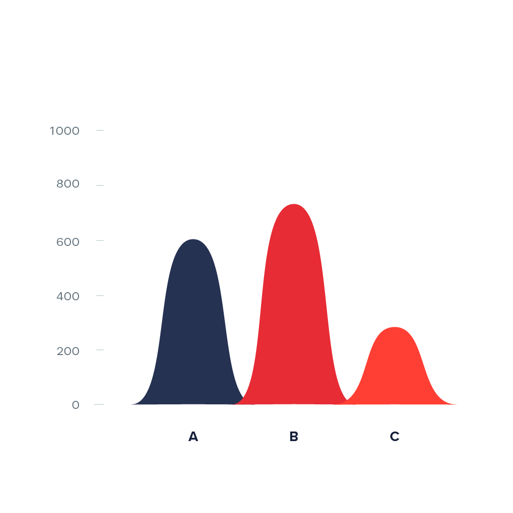
Curved Bar Chart

A curved bar chart is a variation of bar chart where curved areas are used instead of rectangles. Height of each curved area is proportional to the values it represents. The curved areas can be plotted vertically or horizontally. One axis of the chart shows the specific categories being compared, and the other axis represents a discrete value.
Curved bar charts are often seen in modern infographics, but are criticized for being confusing and inaccurate compared to a normal bar chart, as the curved area actually only has one dimension, which is the height.
Examples
-
http://linkedinmonitor.nl">
-
https://www.instagram.com/the.visual.agency/">
-
https://www.flickr.com/photos/densitydesign/8089718811/">
-
http://slidebazaar.com/items/data-chart-analytics/">
-
https://www.behance.net/gallery/30463125/Cross-linguistic-controversy-shapes-MSc-Thesis">
-
https://www.behance.net/gallery/30961821/Nike-Fuel-Script-Seal">
-
https://i.pinimg.com/originals/c3/d0/dd/c3d0dd249dcd8582db0a086baa570df3.jpg">