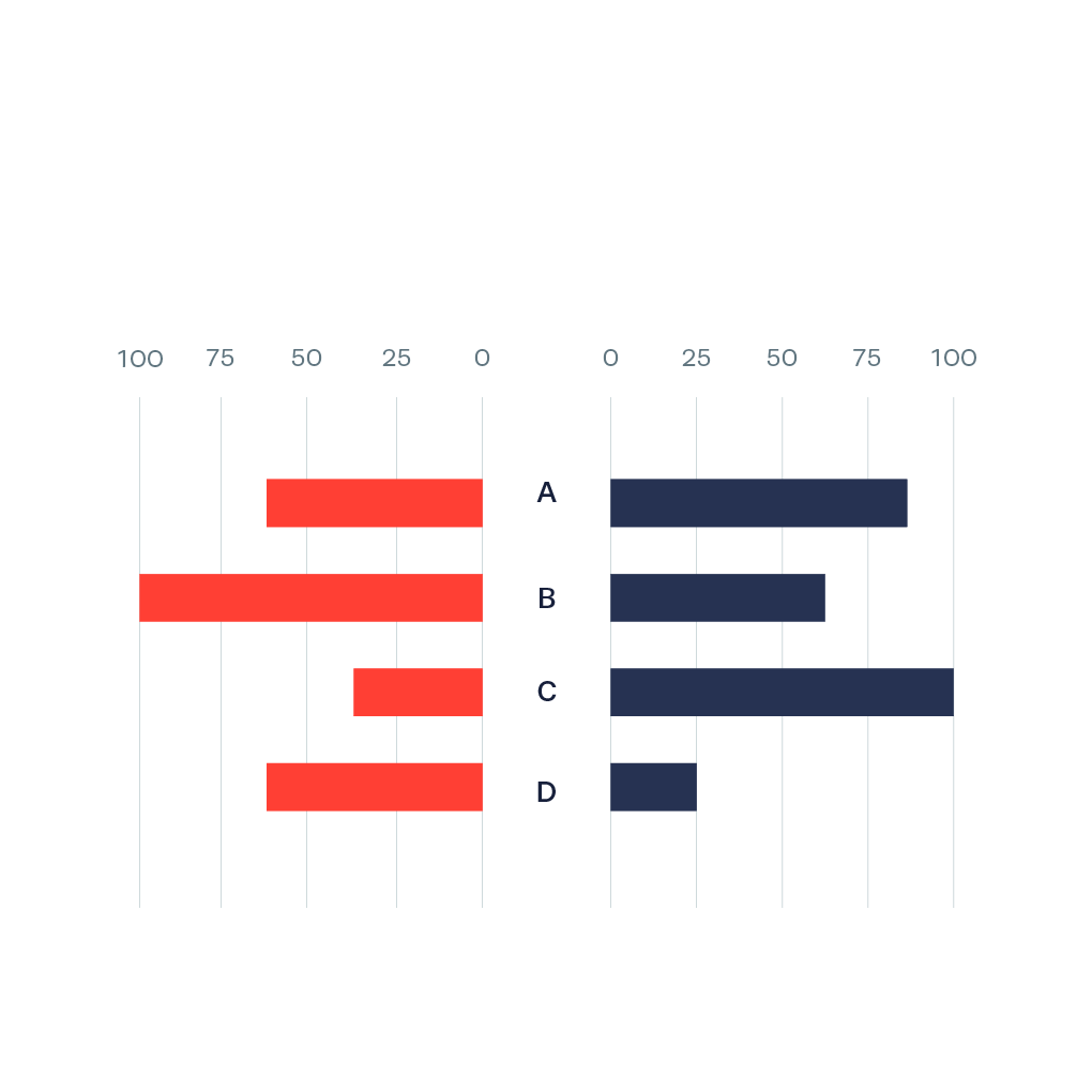
Butterfly Chart
Also called: Tornado Chart, Tornado diagram

A Butterfly Chart (also called Tornado Chart) is a type of bar chart where two sets of data series are displayed side by side. It gives a quick glance of the difference between two groups with same parameters. It is also possible to stack/place two bars on each side (for example, ‘developed countries’ and ‘developing countries’) to give a further division of categories.
The main use of the butterfly chart is comparison of two data sets sharing the same parameters.
It has a lot of similarity with the population pyramid, but where the population pyramid is only for population data, the butterfly chart has a broader use as a comparison chart.
Examples
-
https://www.behance.net/gallery/10020197/Visualizing-Ageing-People">
-
https://www.behance.net/gallery/10020197/Visualizing-Ageing-People">
-
https://www.behance.net/gallery/14186183/Audubon-2013-Visualizing-the-Future-of-Conservation">
-
https://www.flickr.com/photos/densitydesign/">
-
http://mapsontheweb.zoom-maps.com/post/115576338876/us-labor-pool-for-defense-1940-more-maps-from">
-
http://iibstudio.com/project/global-economic-cancer-burden/">
-
http://www.thevisualagency.com">