Insects 2025, 16(2), 198; https://doi.org/10.3390/insects16020198 - 12 Feb 2025
Viewed by 430
Abstract
►
Show Figures
While olive trees are primarily wind-pollinated, biodiversity-friendly management of the groves can contribute to the conservation of pollinating insects in olive agroecosystems. Previous research demonstrated that semi-natural habitats, such as herbaceous linear elements and woody areas, support the community of pollinators in agroecosystems.
[...] Read more.
While olive trees are primarily wind-pollinated, biodiversity-friendly management of the groves can contribute to the conservation of pollinating insects in olive agroecosystems. Previous research demonstrated that semi-natural habitats, such as herbaceous linear elements and woody areas, support the community of pollinators in agroecosystems. Less is known about the contribution of low-input olive groves with a permanent ground cover on terraced landscapes. This study investigated the relationship between pollinator communities and semi-natural habitats, including spontaneous vegetation, in a traditional terraced Mediterranean olive grove agroecosystem. The research employed pan traps to monitor wild bees and observation walks to assess the butterfly community across three different habitat types in spring, summer, and autumn during two growing seasons. Floral resources in the habitats were assessed during each sampling time. Analysis showed that herbaceous habitats support a higher abundance of wild bees than woody areas, while olive groves do not differ significantly from either habitat type, despite exhibiting the highest floral abundance. This suggests that habitat structure, rather than floral availability alone, plays a role in maintaining the wild bee community. For butterflies, results demonstrate that the overall abundance does not differ between habitats, while the species composition does. The study emphasizes the importance of preserving diverse habitats, and in particular low-input olive groves, within agricultural landscapes to support a wide range of pollinator species.
Full article

Figure 1
Figure 1
<p>Monthly cumulated rainfall and average minimum and maximum monthly temperature (maximum and minimum) Uliveto Terme weather station, from January 2013 to December 2022.</p> Full article ">Figure 2
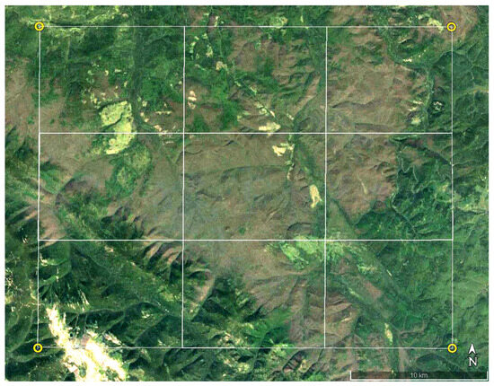
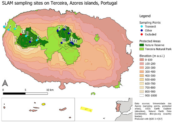
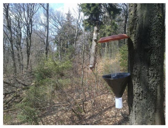
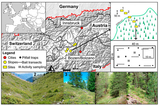
<p>Inset map: location of the study area in Central-Western Italy. Main canvas: example of a UTM 1 km<sup>2</sup> study unit, showing the sampling setup in the three different habitats.</p> Full article ">Figure 3
<p>Abundance of wild bees and bumblebees (square root transformed) in both years (2021 and 2022 aggregated) across the three habitats: (<b>a</b>) (HL: herbaceous linear, OL: olive grove, WA: woody area); and four sampling times: (<b>b</b>) (T1: May, T2: June, T3: July, T4: September). Significant differences between habitats and sampling times are denoted by different letters (<span class="html-italic">p</span> < 0.05, with Hochberg’s adjustment). Large black dots in panels (<b>a</b>,<b>b</b>) represent the means for each group.</p> Full article ">Figure 4
<p>Abundance of flowers (log-transformed) in both years (2021 and 2022 aggregated) across the three habitats: (<b>a</b>) (HL: herbaceous linear, OL: olive grove, WA: woody area); and four sampling times: (<b>b</b>) (T1: May, T2: June, T3: July, T4: September). Significant differences between habitats and sampling times are denoted by different letters (<span class="html-italic">p</span> < 0.05, with Hochberg’s adjustment). Large black dots in panels (<b>a</b>,<b>b</b>) represent the means for each group.</p> Full article ">Figure 5
<p>NMDS plots showing the differences in flower community composition across sampling times (<b>a</b>) and habitats (<b>b</b>). The analysis was based on the Bray–Curtis dissimilarity matrix, calculated using the square-root transformed species abundance data. NMDS stress value = 0.221. Panel (<b>a</b>): shapes represent the different habitats: herbaceous linear (HL, circles), olive grove (OL, triangles), and woody area (WA, squares). Colors represent the four sampling times: May (T1: red), June (T2: blue), July (T3: green), and September (T4: purple). Convex hulls illustrate the grouping of communities within each time. Panel (<b>b</b>): shapes represent the different sampling times: T1 (circles), T2 (triangles), T3 (squares), and T4 (crosses). Colors indicate the two habitats: olive grove (OL, green) and woody area (WA, brown). Herbaceous linear (HL) is not shown to ease interpretation. Convex hulls illustrate the separation of communities within each habitat.</p> Full article ">Figure 6
<p>Butterfly abundance (square root transformed) in both years (2021 and 2022 aggregated) across the three habitats: (<b>a</b>) (HL: herbaceous linear, OL: olive grove, WA: woody area); and four sampling times: (<b>b</b>) (T1: May, T2: June, T3: July, T4: September). Significant differences between sampling times are indicated by different letters (<span class="html-italic">p</span> < 0.05 with Hochberg’s adjustment). The black circles represent the mean butterfly abundance.</p> Full article ">Figure 7
<p>NMDS plots showing the differences in butterfly community composition across sampling times (<b>a</b>) and habitats (<b>b</b>). The analysis was based on the Bray–Curtis dissimilarity matrix, calculated using the square-root transformed species abundance data. NMDS stress value = 0.245. A: shapes represent the different habitats: herbaceous linear (HL, circles), olive grove (OL, triangles), and woody area (WA, squares). Colors represent the four sampling times: May (T1: red), June (T2: blue), July (T3: green), and September (T4: purple). Convex hulls illustrate the grouping of communities within each time. B: shapes represent the different sampling times: T1 (circles), T2 (triangles), T3 (squares), and T4 (crosses). Colors indicate the three habitats: HL (light green), OL (dark green), and WA (brown). Convex hulls illustrate the separation of communities within each habitat.</p> Full article ">
<p>Monthly cumulated rainfall and average minimum and maximum monthly temperature (maximum and minimum) Uliveto Terme weather station, from January 2013 to December 2022.</p> Full article ">Figure 2
<p>Inset map: location of the study area in Central-Western Italy. Main canvas: example of a UTM 1 km<sup>2</sup> study unit, showing the sampling setup in the three different habitats.</p> Full article ">Figure 3
<p>Abundance of wild bees and bumblebees (square root transformed) in both years (2021 and 2022 aggregated) across the three habitats: (<b>a</b>) (HL: herbaceous linear, OL: olive grove, WA: woody area); and four sampling times: (<b>b</b>) (T1: May, T2: June, T3: July, T4: September). Significant differences between habitats and sampling times are denoted by different letters (<span class="html-italic">p</span> < 0.05, with Hochberg’s adjustment). Large black dots in panels (<b>a</b>,<b>b</b>) represent the means for each group.</p> Full article ">Figure 4
<p>Abundance of flowers (log-transformed) in both years (2021 and 2022 aggregated) across the three habitats: (<b>a</b>) (HL: herbaceous linear, OL: olive grove, WA: woody area); and four sampling times: (<b>b</b>) (T1: May, T2: June, T3: July, T4: September). Significant differences between habitats and sampling times are denoted by different letters (<span class="html-italic">p</span> < 0.05, with Hochberg’s adjustment). Large black dots in panels (<b>a</b>,<b>b</b>) represent the means for each group.</p> Full article ">Figure 5
<p>NMDS plots showing the differences in flower community composition across sampling times (<b>a</b>) and habitats (<b>b</b>). The analysis was based on the Bray–Curtis dissimilarity matrix, calculated using the square-root transformed species abundance data. NMDS stress value = 0.221. Panel (<b>a</b>): shapes represent the different habitats: herbaceous linear (HL, circles), olive grove (OL, triangles), and woody area (WA, squares). Colors represent the four sampling times: May (T1: red), June (T2: blue), July (T3: green), and September (T4: purple). Convex hulls illustrate the grouping of communities within each time. Panel (<b>b</b>): shapes represent the different sampling times: T1 (circles), T2 (triangles), T3 (squares), and T4 (crosses). Colors indicate the two habitats: olive grove (OL, green) and woody area (WA, brown). Herbaceous linear (HL) is not shown to ease interpretation. Convex hulls illustrate the separation of communities within each habitat.</p> Full article ">Figure 6
<p>Butterfly abundance (square root transformed) in both years (2021 and 2022 aggregated) across the three habitats: (<b>a</b>) (HL: herbaceous linear, OL: olive grove, WA: woody area); and four sampling times: (<b>b</b>) (T1: May, T2: June, T3: July, T4: September). Significant differences between sampling times are indicated by different letters (<span class="html-italic">p</span> < 0.05 with Hochberg’s adjustment). The black circles represent the mean butterfly abundance.</p> Full article ">Figure 7
<p>NMDS plots showing the differences in butterfly community composition across sampling times (<b>a</b>) and habitats (<b>b</b>). The analysis was based on the Bray–Curtis dissimilarity matrix, calculated using the square-root transformed species abundance data. NMDS stress value = 0.245. A: shapes represent the different habitats: herbaceous linear (HL, circles), olive grove (OL, triangles), and woody area (WA, squares). Colors represent the four sampling times: May (T1: red), June (T2: blue), July (T3: green), and September (T4: purple). Convex hulls illustrate the grouping of communities within each time. B: shapes represent the different sampling times: T1 (circles), T2 (triangles), T3 (squares), and T4 (crosses). Colors indicate the three habitats: HL (light green), OL (dark green), and WA (brown). Convex hulls illustrate the separation of communities within each habitat.</p> Full article ">